The Voice of Innovation
C&C is a Marketing and PR agency in Latam, representing some of the most high-end enterprises in the world. When creating their digital presence, they wanted the work to speak for itself while communicating their innovative approach and celebrating their exclusive clientele.

Golden Ratio
I led the design of the menu, ensuring it not only facilitated navigation but also reinforced the brand’s storytelling. Our strategy was to evoke a sense of accomplishment by seamlessly integrating the client’s work across various sections—including the menu itself.
To achieve this, I structured the layout using the divine proportion curve, creating a natural hierarchy that accommodated different content types. This approach enabled smooth transitions between categories and case studies while offering the client flexibility to showcase new work—without the need for a dedicated “new” section, which they wanted to avoid due to longer project timelines.

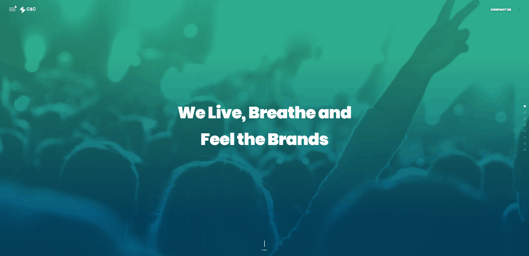
Visually Engaging
Our goal was to make the site feel visually rich and immersive. To achieve this, we introduced the concept of a partial reveal window, designed to spark curiosity when paired with the client’s name.
To determine the optimal overlay, I experimented with low-fidelity sketches over generic photographs, exploring how different formats influenced perception. This iterative process helped us refine a design that not only enhanced engagement but also aligned seamlessly with the client’s brand identity.

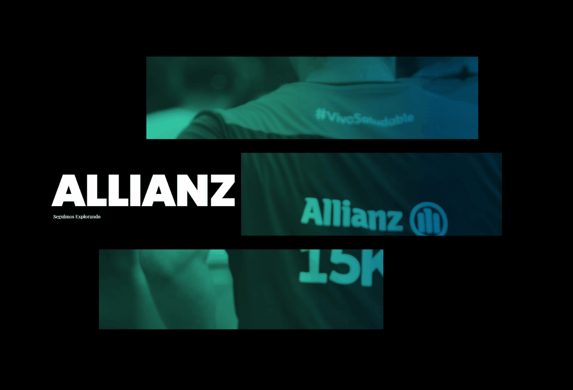
Image Guidelines
As the team was also working on the branding, we ensured that the site maintained a cohesive visual identity by providing imagery guidelines. We recommended using images that featured people rather than just services or corporate settings, helping to convey a sense of lifestyle, optimism, and a more human-centered approach. This not only reinforced the brand’s message but also made the site feel more relatable and engaging to users.


Speaking to Brand Identity
The logo is often the first impression of a company’s brand, making it the simplest yet most effective way to communicate its essence. As a communication agency, it was essential that the logo not only represented the company but also reflected their vision and values.
The graphic design team developed a logo that encapsulated the motto of collaboration and community, while also aligning with their PR and marketing goals. Additionally, Paperplane provided detailed guidelines for the logo’s use, ensuring consistency and maximum impact across all platforms.


Sizing


Improper use of Logo

Don't bring items close

Don't change icon colors

Don't squeeze/stresh logo
Strong Visual
Foundation
We created comprehensive brand guidelines, including color palettes and typefaces, to establish a strong visual hierarchy. These elements set the tone for the website, ensuring consistency while achieving a harmonious graphic balance across all pages. This approach not only enhanced the user experience but also reinforced the brand’s identity in every visual detail.


Text Bosy and Short Text
TITLES
Subtitles
